


.png)
Pride Design
As hundreds of thousands of visitors and millions of viewers turn their attention to Seattle during Pride Weekend, we have a rare opportunity to make a lasting impact—one that educates the world, inspires our LGBTQ+ community, and uplifts LGBTQ+ businesses and cultural organizations. The Seattle Pride design will stand as an iconic visual legacy, connecting people everywhere to our city and state during the largest sporting event in history. The designs celebrate LGBTQ+ pride, showcase the distinct character of our region, and embody the unifying spirit of the World Cup—reminding all that inclusion is Seattle’s greatest strength.

The Contest Process
We began by inviting artists from Washington State with credibility in authentically representing the LGBTQ+ community. Our aim was to find a design that connected the FIFA World Cup 26™ with a powerful message of LGBTQ+ inclusivity.
The contest process allowed Artists who registered to choose between submitting a final design or a portfolio with a design concept. All submissions were due in July of 2025.
The SeattleFWC26 Pride + Matchday Impact Council was then tasked with reviewing all complete entries. They selected three finalist designs that best captured Seattle’s identity as a diverse, inclusive community and a leader in LGBTQ+ rights
SeattleFWC26 will utilize the finalist's designs for Pride Matchday purposes and will be incorporated into SeattleFWC26’s citywide celebration as our region prepares to host the world’s largest sporting event.
Disclaimer: The Pride Matchday design is an independent creation specifically for the Seattle FWC26 LOC and is not an official FIFA asset. It is not affiliated with or endorsed by FIFA.
Meet The Finalists
.avif)
Kelly Bjork is a queer artist making queer art in a[nother] time in which the LGBTQ+ community is facing discrimination at every level: social, physical, and political. In this way, they position themselves within a lineage of artists who have done the same in the face of violence. Bjork creates space to leave the harsh world of now, for a moment, and enter their world to be held and seen. Their work serves as a reminder to both those who struggle to remember, and those who refuse to accept, that we aren’t going anywhere. We will continue to experience joy, tenderness and love.
About the Design
For my design, I envisioned a layering of figures vertically stacked, propping each other up and interacting with a soccer ball as it moves its way to the top of the image. The movement of the soccer ball between the figures who physically prop each other up serve as visual representations: of the power of soccer to connect people from various backgrounds and the power of connection through love of soccer to create community across diverse identities. In this design, fans, whether part of the LGBTQ+ community or allies, can see themselves reflected as part of a larger tapestry of support. The figures are a group of diverse individuals highlighting how vast and varied the LGBTQ+ community is; all colors, shapes, sizes and abilities!
Where to Find This Design
Kelly Bjork’s Pride Match design has been selected for the official Pride Matchday Scarf, created as part of the Seattle FIFA World Cup 26™ community celebrations. The scarf will be worn and shared by fans during Pride Matchday and related events, giving Kelly’s artwork a visible presence in the stands and throughout the city during one of Seattle’s most meaningful World Cup moments.
%201.avif)
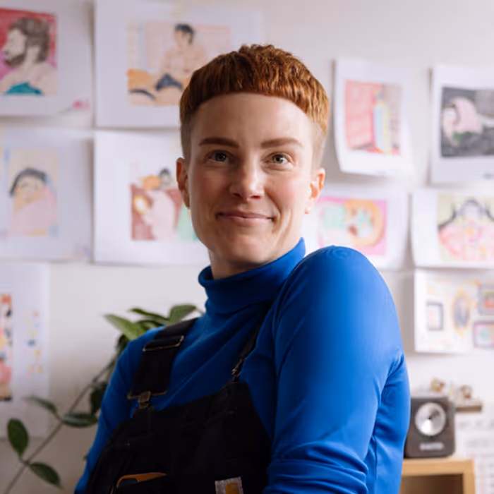
Shayla Hufana (she/her) is a Filipina-American visual artist and multidisciplinary designer from Seattle. With a BFA in Graphic Design and over 16 years of experience, she creates dynamic designs and vibrant public art that celebrate culture and community. As founder of ConceptShell, Shayla amplifies diverse voices through visually impactful storytelling—from logos and murals to immersive brand experiences. Her work has been featured in Times Square, showcased at Slip Gallery, recognized by Graphic Design USA, and highlighted recently by Seattle Kraken as their 2024–2025 Lunar New Year Jersey Artist. She’s collaborated with AIGA, SEGD and Urban ArtWorks, using art to connect AANHPI, BIPOC, and LGBTQ+ communities.
About the Design
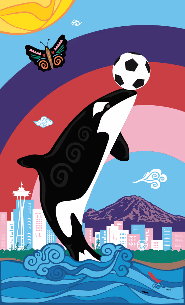
Fly Together is a joyful celebration of pride, inclusivity, and community, bringing together the colors of the Progress and Transgender Pride Flags with the beauty of the Pacific Northwest. At the heart of the design, an Orca rises from the Salish Sea, balancing a soccer ball—honoring both this region’s beloved native species and the Seattle Sounders FC mascot, Sammy the Sounder. A warm sun and rainbow stretches across the skyline, mountains, and waters, shining hope, pride, and visibility, while the butterfly symbolizes transformation, freedom, and the people of Washington. Salmon swim through the water, carrying strength, resilience, and perseverance. Altogether, the poster is a celebration of connection, collaboration, and the joy that unites our sports community.
Where to Find This Design
Shayla’s design has been selected as the official Pride Pin in SEA&WIN, SeattleFWC26’s interactive mobile game. From May 11- 31, players will be able to collect the digital Pride Pin as they explore locations across Washington, complete challenges, and participate in Pride Matchday experiences. Thousands of players will encounter Shayla’s work as part of their journey through the app.
.avif)
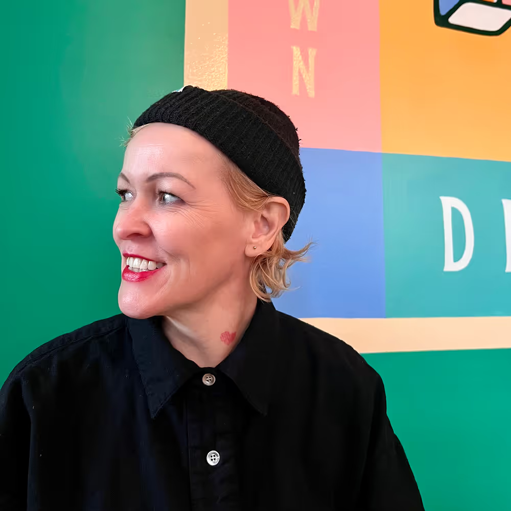
Sharon Blyth-Moss is originally from Burntwood, England, but has called Seattle home for over 25 years. During the COVID lockdown, Sharon, a lifelong creative, was able to devote time to her passion for art and returned to school to study graphic design. She co-owns a unique community hub in the Central District—a combined café and hair salon—with her wife. The space serves as a welcoming gathering spot where creativity, conversation, and connection thrive. When she’s not cutting hair, designing posters, or painting, Sharon can be found biking around the city, digging in her garden, or tinkering on her keyboard.
About the Design
I wanted to design a poster that blends powerful symbols of Washington with themes of strength, resilience, and community—qualities that Seattle’s queer community has long embodied. I also wanted the design to feel celebratory and fun, honoring both the challenges we've overcome and the vibrant culture we've built. Mount Rainier stands tall in the background—an iconic symbol of Washington and a metaphorical pinnacle representing the progress we've made in LGBTQ+ rights here in Seattle.
A Dungeness crab, named after the Dungeness Spit in Washington, symbolizes resilience, adaptability, and resourcefulness. In its claws, it holds a WSF ferry—part of the largest ferry system in the U.S.—which serves as a vital marine highway connecting communities across the region. A cedar branch pays homage to the Indigenous peoples of the Puget Sound, whose traditions and presence remain integral to this land. And of course, a strong cup of coffee—a nod to Seattle's global reputation and to the local coffee shops that continue to serve as hubs of connection, creativity, and queer community life. All this while also playing goalie!
Where to Find This Design
Sharon’s Pride Matchday design has been selected for the SeattleFWC26 Monorail Art Exhibit, currently being installed along the Seattle Center Monorail corridor. The installation will welcome fans traveling between downtown and Seattle Center, turning the monorail route into a vibrant celebration of Pride, art, and global football.